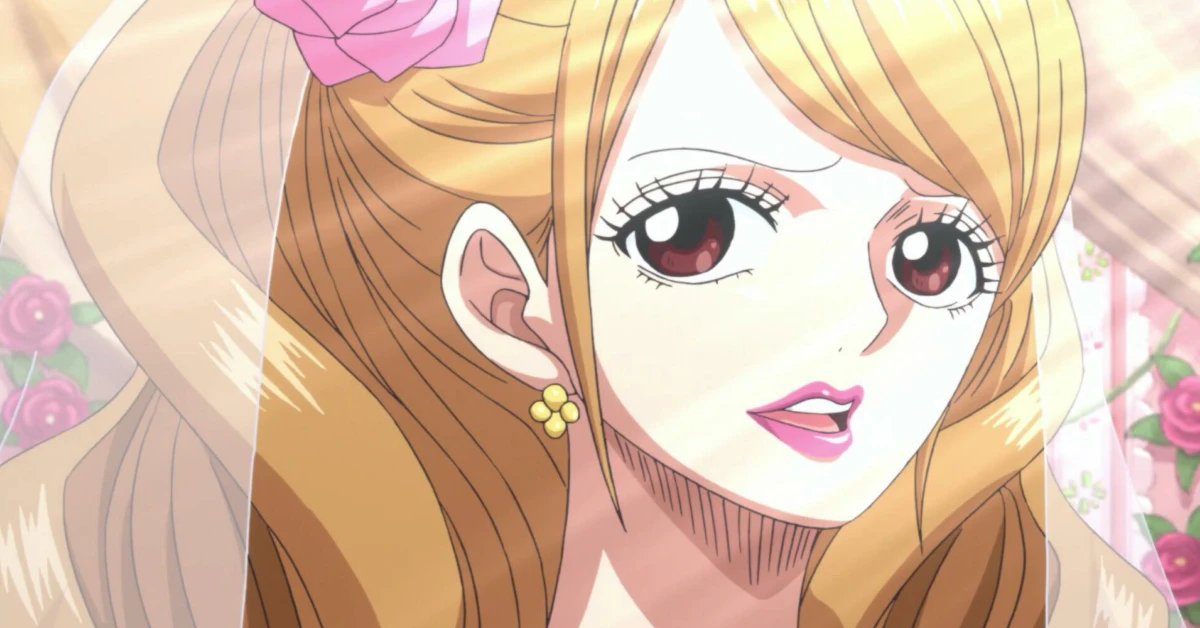
Charlotte Pudding is a complex One Piece character whose visual identity perfectly balances sweetness with underlying menace. Her official color palette offers designers precise HEX codes for authentic fan art or candy-themed UI projects. The dominant Illusion (#F7B2D1) pastel pink captures her deceptive innocence, while Red Violet (#C71585) accents reveal her dangerous femme fatale nature. Warm Yellow Orange (#FFB347) adds vibrant Totto Land energy to hair gradients and accessories. This curated five-color system provides accessible contrast ratios and semantic meaning, making it an ideal reference for designers seeking accurate Charlotte Pudding color codes that reflect her dual personality through strategic hue selection.
Charlotte Pudding One Piece Color Codes: HEX, RGB, CMYK
| Preview | Color Name | HEX | RGB | CMYK |
|---|---|---|---|---|
| Illusion | #F7B2D1 | 247, 178, 209 | 0, 28, 15, 3 | |
| Red Violet | #C71585 | 199, 21, 133 | 0, 89, 33, 22 | |
| Yellow Orange | #FFB347 | 255, 179, 71 | 0, 30, 72, 0 | |
| Valentino | #4A0E4E | 74, 14, 78 | 5, 82, 0, 69 | |
| Cream | #FFFDD0 | 255, 253, 208 | 0, 1, 18, 0 |
Charlotte Pudding CSS & Tailwind Color Variables
Select your preferred format and copy the ready-to-use CSS variables for your web projects.
:root {
/* Charlotte Pudding One Piece Palette */
--charlotte-pudding-one-piece-illusion: #F7B2D1;
--charlotte-pudding-one-piece-red-violet: #C71585;
--charlotte-pudding-one-piece-yellow-orange: #FFB347;
--charlotte-pudding-one-piece-valentino: #4A0E4E;
--charlotte-pudding-one-piece-cream: #FFFDD0;
}
More One Piece Character Color Palettes Color Codes (Pink Palette)


Charlotte Pudding CSS Gradients
Beautiful gradient backgrounds inspired by Charlotte Pudding’s aesthetic. Click to copy the CSS code.
Charlotte Pudding Color Scheme Breakdown
Illusion#F7B2D1
This soft pastel pink dominates her voluminous twin-tails hair, reflecting her initial facade of sweetness and the childlike duality of her romantic yet dangerous personality.
Red Violet#C71585
A deep vivid magenta found on her famous heart-shaped tattoo around the third eye and her bikini top, symbolizing raw feminine power, passion, and her femme fatale nature.
Yellow Orange#FFB347
This warm pastel orange appears as the secondary tone in her hair gradient and the floral patterns on her wide-brimmed hat, adding a vibrant, candy-like contrast characteristic of Totto Land’s aesthetic.
Valentino#4A0E4E
A dark purple used for her iconic demon-horned hat band and the highlights on her leather gloves, visually grounding her design with an air of mystery, menace, and authority as a Big Mom pirate.
Cream#FFFDD0
A creamy off-white present in her flowy cape-like jacket, serving as a neutral canvas that balances the saturated candy colors of her outfit and emphasizes the elegance of her patissier-inspired silhouette.
Charlotte Pudding 60-30-10 Design Rule
Apply the classic 60-30-10 UI design rule using Charlotte Pudding’s palette for a perfectly balanced visual hierarchy.
Charlotte Pudding UI Component Preview
Here is a live example of how the Charlotte Pudding color palette looks when applied to a modern UI component.
Charlotte Pudding
Deceptive Patissier
“I’m not a good person… but I’m not a bad person either!”
Charlotte Pudding Gaming Setup (RGB Peripherals)
Sync your gaming gear! Use these exact RGB values for your Razer Chroma, Corsair iCUE, or Logitech G Hub software to match Charlotte Pudding’s aesthetic.
- Main LED: 247, 178, 209
- Accent LED: 199, 21, 133
The Design Philosophy behind Charlotte Pudding’s Palette
Charlotte Pudding’s color scheme masterfully encodes her narrative duality through deliberate chromatic contrasts. The soft Illusion (#F7B2D1) pink establishes her patissier facade and childlike charm, essential for UI themes requiring approachable aesthetics. However, the intense Red Violet (#C71585) used on her third-eye tattoo and bikini top signals hidden passion and danger, creating visual tension that mirrors her character arc. Valentino (#4A0E4E) dark purple grounds the palette with authority, preventing the candy tones from appearing frivolous in professional designs. Cream (#FFFDD0) acts as a crucial neutral buffer, ensuring readability and elegance. This philosophy proves that effective character-inspired palettes aren’t merely decorative; each HEX code serves storytelling and functional accessibility purposes simultaneously.
Best Charlotte Pudding Color Combinations
Sweet Deception Contrast
The soft Illusion pink and vivid Red Violet create high emotional contrast ideal for highlighting dual-nature UI elements like toggle states or character profile cards.
Candy Authority Balance
Warm Yellow Orange paired with deep Valentino purple delivers vibrant yet grounded accent combinations perfect for buttons, badges, or navigation highlights in playful interfaces.
Explore More One Piece Character Color Palettes Character Color Codes


Download Charlotte Pudding One Piece Color Palette
Charlotte Pudding .ASE Swatches
For Adobe Swatches & Procreate
Charlotte Pudding .SVG Palette
Vector Color Palette
Charlotte Pudding .PNG Image
High-Quality Palette Preview
FAQs about Charlotte Pudding One Piece Color Codes
What is the exact HEX code for Charlotte Pudding’s twin-tail hair color?
Charlotte Pudding’s voluminous twin-tails use the pastel pink HEX code #F7B2D1, named Illusion, representing her sweet facade and romantic duality.
Which colors define Charlotte Pudding’s main outfit and hat design?
Her primary outfit combines Cream (#FFFDD0) for the cape jacket and Yellow Orange (#FFB347) for hat florals, balanced by Valentino (#4A0E4E) on the demon-horned hat band.
What HEX code represents Charlotte Pudding’s third-eye tattoo and dangerous side?
The heart-shaped third-eye tattoo and bikini top use Red Violet #C71585, symbolizing her raw feminine power, passion, and femme fatale nature beneath the sweet exterior.