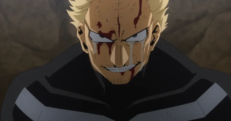
Yoshinobu Gakuganji, the iron-willed Principal of Kyoto Jujutsu High, embodies decades of conservative authority in Gege Akutami’s Jujutsu Kaisen universe. His visual design is a masterclass in restrained, monochromatic storytelling. The palette anchors itself in #1A1A2E Mirage for his austere principal robes, transitions through the muted #A3A3A3 Quick Silver of his aged hair, and softens only at the collar with #E8E0D0 White Rock accents. Every HEX code in Gakuganji’s color scheme reinforces his unyielding rigidity and deep-rooted devotion to jujutsu tradition, making this character’s palette an essential reference for designers crafting authoritative, legacy-driven UI themes.
Yoshinobu Gakuganji Jujutsu Kaisen Color Codes: HEX, RGB, CMYK
| Preview | Color Name | HEX | RGB | CMYK |
|---|---|---|---|---|
| Mirage | #1A1A2E | 26, 26, 46 | 43, 43, 0, 82 | |
| Martinique | #2C2C54 | 44, 44, 84 | 48, 48, 0, 67 | |
| Quick Silver | #A3A3A3 | 163, 163, 163 | 0, 0, 0, 36 | |
| Whiskey | #D4A574 | 212, 165, 116 | 0, 22, 45, 17 | |
| White Rock | #E8E0D0 | 232, 224, 208 | 0, 3, 10, 9 |
Yoshinobu Gakuganji CSS & Tailwind Color Variables
Select your preferred format and copy the ready-to-use CSS variables for your web projects.
:root {
/* Yoshinobu Gakuganji Jujutsu Kaisen Palette */
--yoshinobu-gakuganji-jujutsu-kaisen-mirage: #1A1A2E;
--yoshinobu-gakuganji-jujutsu-kaisen-martinique: #2C2C54;
--yoshinobu-gakuganji-jujutsu-kaisen-quick-silver: #A3A3A3;
--yoshinobu-gakuganji-jujutsu-kaisen-whiskey: #D4A574;
--yoshinobu-gakuganji-jujutsu-kaisen-white-rock: #E8E0D0;
}
More Jujutsu Kaisen Character Color Palettes Color Codes (Black Palette)
Mei Mei Color Codes & HEX Palette – Jujutsu Kaisen Character Color Scheme
Riko Amanai Color Codes – Jujutsu Kaisen Palette with HEX, RGB & CMYK Values
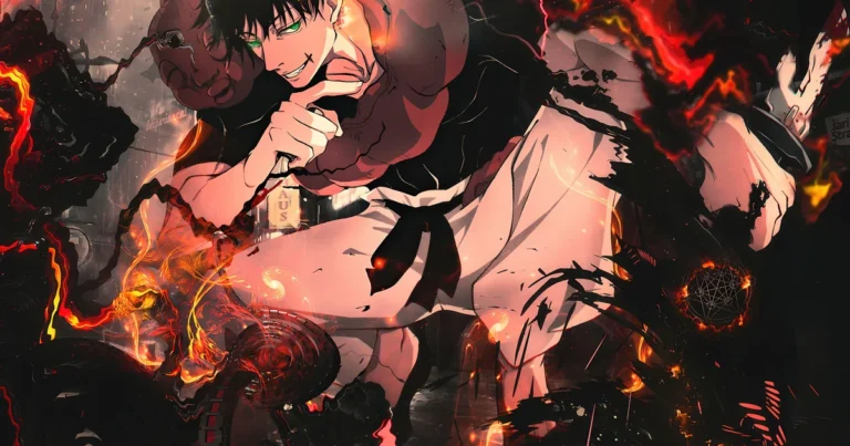
Toji Fushiguro Color Codes: Complete Jujutsu Kaisen Palette & HEX Values for Designers
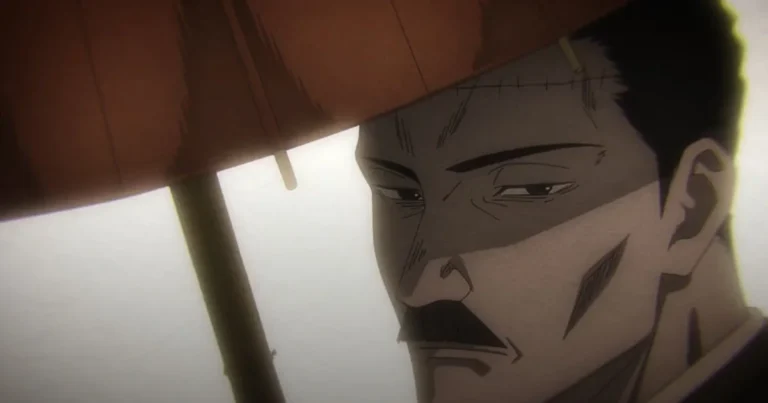
Noritoshi Kamo Color Palette – Jujutsu Kaisen HEX Codes, RGB & CMYK Values
Yoshinobu Gakuganji CSS Gradients
Beautiful gradient backgrounds inspired by Yoshinobu Gakuganji’s aesthetic. Click to copy the CSS code.
Yoshinobu Gakuganji Color Scheme Breakdown
Mirage#1A1A2E
The deep dark navy-black of Gakuganji’s principal robes, conveying his austere authority and traditional rigidity as the stern head of Kyoto Jujutsu High.
Martinique#2C2C54
The slightly lighter dark indigo seen in the inner layers and folds of his traditional garment, adding subtle depth to his otherwise monochromatic silhouette.
Quick Silver#A3A3A3
The muted silver-grey of his aged hair, reflecting his elderly status, decades of jujutsu experience, and unwavering conservative worldview within the series.
Whiskey#D4A574
The warm weathered skin tone of his face and hands, grounding his otherwise dark palette and emphasizing his humanity beneath his cold, judgmental demeanor.
White Rock#E8E0D0
The off-white hue visible at his collar and inner garment edges, representing the last trace of purity and tradition he clings to as a jujutsu elder.
Yoshinobu Gakuganji 60-30-10 Design Rule
Apply the classic 60-30-10 UI design rule using Yoshinobu Gakuganji’s palette for a perfectly balanced visual hierarchy.
Yoshinobu Gakuganji UI Component Preview
Here is a live example of how the Yoshinobu Gakuganji color palette looks when applied to a modern UI component.
Yoshinobu Gakuganji
Stern Kyoto Principal
“The execution of Itadori Yuji is non-negotiable. Tradition must be upheld at all costs.”
Yoshinobu Gakuganji Gaming Setup (RGB Peripherals)
Sync your gaming gear! Use these exact RGB values for your Razer Chroma, Corsair iCUE, or Logitech G Hub software to match Yoshinobu Gakuganji’s aesthetic.
- Main LED: 26, 26, 46
- Accent LED: 44, 44, 84
The Design Philosophy behind Yoshinobu Gakuganji’s Palette
The creative team behind Jujutsu Kaisen engineered Gakuganji’s color codes to mirror his narrative function as an immovable institutional pillar. The near-black #1A1A2E Mirage paired with the slightly lifted #2C2C54 Martinique creates a tonal depth that reads as visual weight—communicating decades of accumulated authority without a single bright accent. His #A3A3A3 Quick Silver hair introduces the only cool neutral, symbolizing eroded idealism and time-worn judgment. Meanwhile, the warm #D4A574 Whiskey skin tone prevents the palette from becoming entirely cold, reminding viewers of the human beneath the doctrine. This deliberate absence of saturation or vibrancy makes Gakuganji’s palette a textbook case study in using restrained HEX codes to encode ideological conservatism in character-driven UI and editorial design.
Best Yoshinobu Gakuganji Color Combinations
Institutional Authority
Pairing the deep Mirage navy-black with Quick Silver grey produces a high-contrast, editorial-grade duo ideal for headers, navigation bars, and typography where gravitas and legibility must coexist.
Warm Tradition Accent
The cool Martinique indigo against the warm Whiskey skin tone creates a complementary temperature contrast perfect for call-to-action buttons, card hover states, or highlighted UI elements that need approachability within a dark interface.
Explore More Jujutsu Kaisen Character Color Palettes Character Color Codes

Nobara Kugisaki Color Codes & HEX Palette – Jujutsu Kaisen Character Color Scheme

Atsuya Kusakabe Color Palette – Jujutsu Kaisen Color Codes, HEX & RGB Values

Masamichi Yaga Color Codes – Jujutsu Kaisen Palette & HEX Values for Designers
Mei Mei Color Codes & HEX Palette – Jujutsu Kaisen Character Color Scheme
Download Yoshinobu Gakuganji Jujutsu Kaisen Color Palette
Yoshinobu Gakuganji .ASE Swatches
For Adobe Swatches & Procreate
Yoshinobu Gakuganji .SVG Palette
Vector Color Palette
Yoshinobu Gakuganji .PNG Image
High-Quality Palette Preview
FAQs about Yoshinobu Gakuganji Jujutsu Kaisen Color Codes
What is the exact HEX color code for Gakuganji’s silver-grey hair in Jujutsu Kaisen?
Gakuganji’s aged hair uses the HEX code #A3A3A3, named Quick Silver (RGB 163, 163, 163). It represents his decades of jujutsu experience and conservative worldview, and works perfectly as a secondary text or icon color in dark-themed UI palettes.
What color is Gakuganji’s principal robe and what HEX code should I use?
His signature principal robe is rendered in #1A1A2E, called Mirage (RGB 26, 26, 46). The inner garment folds use a slightly lighter #2C2C54 Martinique indigo. Use Mirage as your primary background or dominant brand color for an authoritative, traditional aesthetic.
Is there a warm accent color in Gakuganji’s palette for highlights or accents?
Yes. The warm skin tone #D4A574 (Whiskey) and the off-white collar detail #E8E0D0 (White Rock) serve as the palette’s only warm accents. White Rock works beautifully for borders, dividers, or subtle highlights, while Whiskey adds organic warmth to buttons or illustrative details.