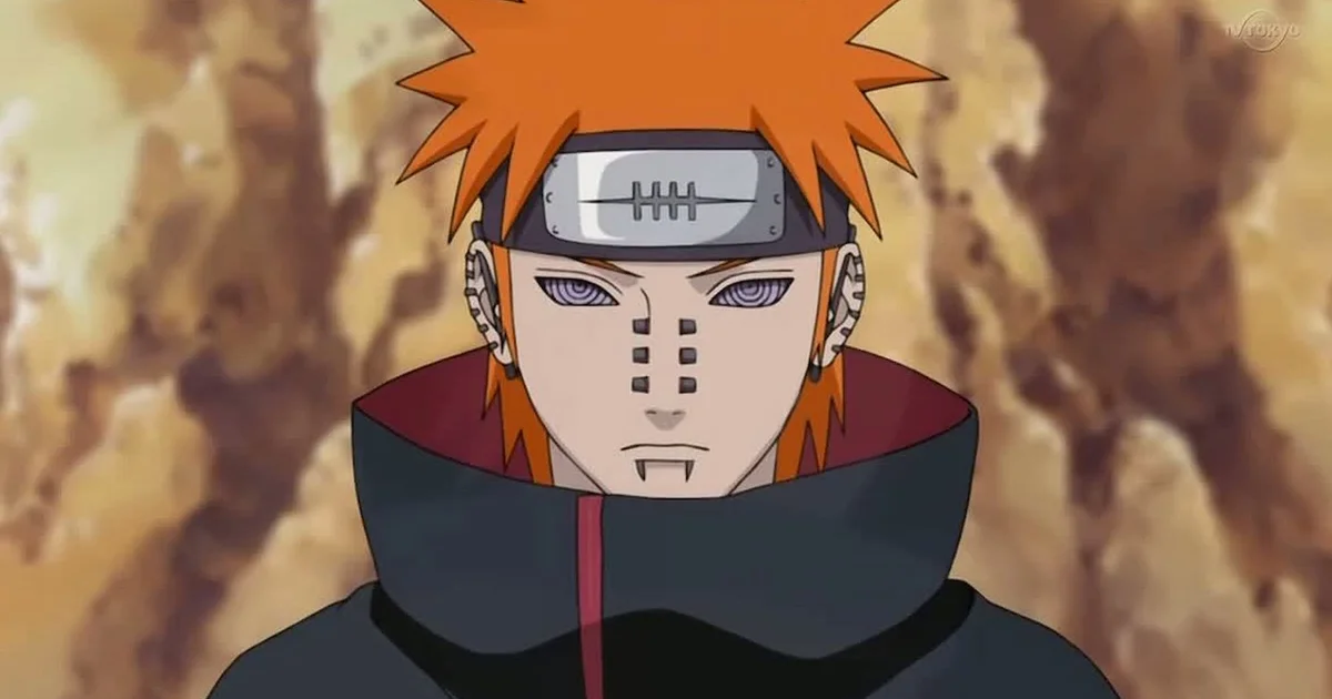
Pain, the enigmatic leader of the Akatsuki in Naruto, features a meticulously crafted color palette that embodies his tragic philosophy and divine authority. For designers seeking accurate Naruto character color codes, this scheme balances intimidation with melancholy. The iconic Akatsuki cloak uses Christine (#E8740C) to signal danger, while Eerie Black (#1A1A1A) reinforces his nihilistic void. His reanimated complexion is defined by Akaroa (#D4C5A9), creating an unsettling pallor essential for authentic UI themes or fan art. These precise HEX values ensure visual accuracy when replicating Pain’s haunting aesthetic across digital platforms, capturing both his power and profound sorrow through intentional color psychology.
Pain Naruto Color Codes: HEX, RGB, CMYK
| Preview | Color Name | HEX | RGB | CMYK |
|---|---|---|---|---|
| Christine | #E8740C | 232, 116, 12 | 0, 50, 95, 9 | |
| Eerie Black | #1A1A1A | 26, 26, 26 | 0, 0, 0, 90 | |
| Buttercup | #F5A623 | 245, 166, 35 | 0, 32, 86, 4 | |
| Hot Toddy | #B8860B | 184, 134, 11 | 0, 27, 94, 28 | |
| Akaroa | #D4C5A9 | 212, 197, 169 | 0, 7, 20, 17 |
Pain CSS & Tailwind Color Variables
Select your preferred format and copy the ready-to-use CSS variables for your web projects.
:root {
/* Pain Naruto Palette */
--pain-naruto-christine: #E8740C;
--pain-naruto-eerie-black: #1A1A1A;
--pain-naruto-buttercup: #F5A623;
--pain-naruto-hot-toddy: #B8860B;
--pain-naruto-akaroa: #D4C5A9;
}
More Naruto Color Codes (Orange Palette)


Pain CSS Gradients
Beautiful gradient backgrounds inspired by Pain’s aesthetic. Click to copy the CSS code.
Pain Color Scheme Breakdown
Christine#E8740C
This vibrant orange defines Pain’s iconic Akatsuki cloak, symbolizing danger and rebellion while serving as the most recognizable visual anchor for the character across all Naruto media and fan art.
Eerie Black#1A1A1A
Deep black forms the inner lining and cloud outlines on the Akatsuki robe, providing stark contrast to the orange and representing the void and nihilistic philosophy central to Pain’s character design.
Buttercup#F5A623
Warm amber tone appears in Nagato’s distinctive long hair, reflecting his Uzumaki lineage heritage and adding organic warmth that balances the otherwise harsh and intimidating color scheme of the antagonist.
Hot Toddy#B8860B
Muted gold-brown represents the metal piercings and chakra receivers embedded throughout Pain’s body, signifying artificial modification and the painful connection between Nagato and his six controlled paths.
Akaroa#D4C5A9
Pale beige skin tone characterizes the Deva Path’s complexion, conveying an unnatural pallor that emphasizes the reanimated corpse nature and emotional detachment essential to Pain’s unsettling visual presence.
Pain 60-30-10 Design Rule
Apply the classic 60-30-10 UI design rule using Pain’s palette for a perfectly balanced visual hierarchy.
Pain UI Component Preview
Here is a live example of how the Pain color palette looks when applied to a modern UI component.
Pain
Nihilistic Antagonist
“Feel pain, know pain, accept pain, understand pain.”
Pain Gaming Setup (RGB Peripherals)
Sync your gaming gear! Use these exact RGB values for your Razer Chroma, Corsair iCUE, or Logitech G Hub software to match Pain’s aesthetic.
- Main LED: 232, 116, 12
- Accent LED: 26, 26, 26
The Design Philosophy behind Pain’s Palette
Pain’s color palette is a masterclass in narrative-driven UI design, where every HEX code serves storytelling. The high-contrast pairing of Christine (#E8740C) and Eerie Black (#1A1A1A) visually manifests his duality: vibrant rebellion against a void of suffering. Buttercup (#F5A623) in his hair subtly honors his Uzumaki heritage, adding organic warmth that humanizes an otherwise detached antagonist. Meanwhile, Hot Toddy (#B8860B) piercings signify artificial modification and chakra transmission, grounding his divine persona in physical pain. This deliberate balance prevents the palette from feeling flat or overly aggressive, making it highly functional for dark-themed interfaces. Designers leverage these colors not just for accuracy, but to evoke emotional resonance—proving that effective character color codes transcend aesthetics to communicate lore, trauma, and ideological conflict within constrained visual systems.
Best Pain Color Combinations
Akatsuki Authority
The extreme contrast between vibrant orange and deep black create immediate visual hierarchy and readability in UI elements like buttons or badges.
Reanimated Warmth
Amber hair tones harmonize with pale beige skin to form a cohesive, low-saturation base that softens harsh accents without losing character identity.
Explore More Naruto Character Color Codes


Download Pain Naruto Color Palette
Pain .ASE Swatches
For Adobe Swatches & Procreate
Pain .SVG Palette
Vector Color Palette
Pain .PNG Image
High-Quality Palette Preview
FAQs about Pain Naruto Color Codes
What is the exact HEX code for Pain’s Akatsuki cloak orange?
Pain’s Akatsuki cloak uses the vibrant orange HEX code #E8740C, named Christine, which symbolizes danger and rebellion in the Naruto universe.
What are the primary colors in Pain’s official Naruto palette?
Pain’s core palette consists of Akatsuki orange (#E8740C) and Eerie Black (#1A1A1A), forming the high-contrast foundation of his iconic robe design.
What HEX code represents Pain’s chakra receiver piercings?
Pain’s metal piercings and chakra receivers use the muted gold-brown HEX #B8860B (Hot Toddy), signifying artificial modification and neural linkage.